DEMOSIMILARITYGRAPHS
a Matlab GUI to explore similarity graphs
by Matthias Hein and Ulrike von Luxburg
PURPOSE
DemoSimilarityGraphs: Given a data set and a similarity function, there are many different ways how a similarity graph can be constructed: epsilon-neighborhood graphs, k-nearest neighbor graphs in different flavors, completely connected graphs, weighted or unweighted graphs, and many more . Additionally, most of those graphs come with a parameter which has to be chosen. The purpose of this demo is to show how different neighborhood graphs can behave on the same data set (see below for more details).
TUTORIAL
DemoSimilarityGraphs has been used for teaching purposes at the Machine Learning Summer School 2007, at the Max-Planck-Institute for Biological Cybernetics, Tuebingen, Germany. The tutorial introduces the different neighborhood graphs and demonstrates properties and some surprising effects using the tool.
Download the tutorial on similarity graphs ![]()
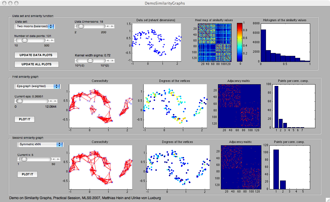
SCREENSHOT OF DemoSimilarityGraphs
PANELS IN DemoSimilarityGraphs
- Data set: here we plot the first two dimensions of the data set. All other dimensions are noise only.
- Heat map of the similarity values: This is a plot of the similarity matrix on the given data points. Each pixel in the plot corresponds to one entry in the similarity matrix. Red means "high value", blue means "low" value. This panel is meant to help the user to adjust a reasonable value sigma for the similarity function. Note that the data points are ordered according to the clusters. Therefore one has a block structure in the similarity matrix.
- Histogram of the similarity values: here we simply plot a histogram of all the entries in the similarity matrix. This panel is also meant to help the user to adjust a reasonable value sigma for the similarity function.
- Connectivity: In this panel we simply plot the edges of the graph. For speed reasons we refrained from color-coding the edge weights (all edges are plotted in the same color, no matter what their edge weight is).
- Degrees of the vertices: The degree of a vertex in the graph is the sum of the edge weights of the adjacent edges. In this plot we color code the degree of all vertices (red = high, blue = low). Note that for all graph types, the degree can be interpreted as a density estimator of the underlying density at the given data point.
- Adjacency matrix: here we show a heat map of the adjacency matrix of the graph. In case the graph is weighted, of course also the adjacency matrix is weighted. Note that the adjacency matrix encodes similarities and edges of the graph.
- Points per connected component: It shows how many connected components the graph has, and how many points each of the connected components contains. This plot is very important, as most graph-based learning algorithms treat different connected components individually.